
Editorial design · 2026
From Promise to Peril and Tracks of Our Tears
Second editions
Project scope
- Art direction
- Editorial design
- Book cover design
Project overview
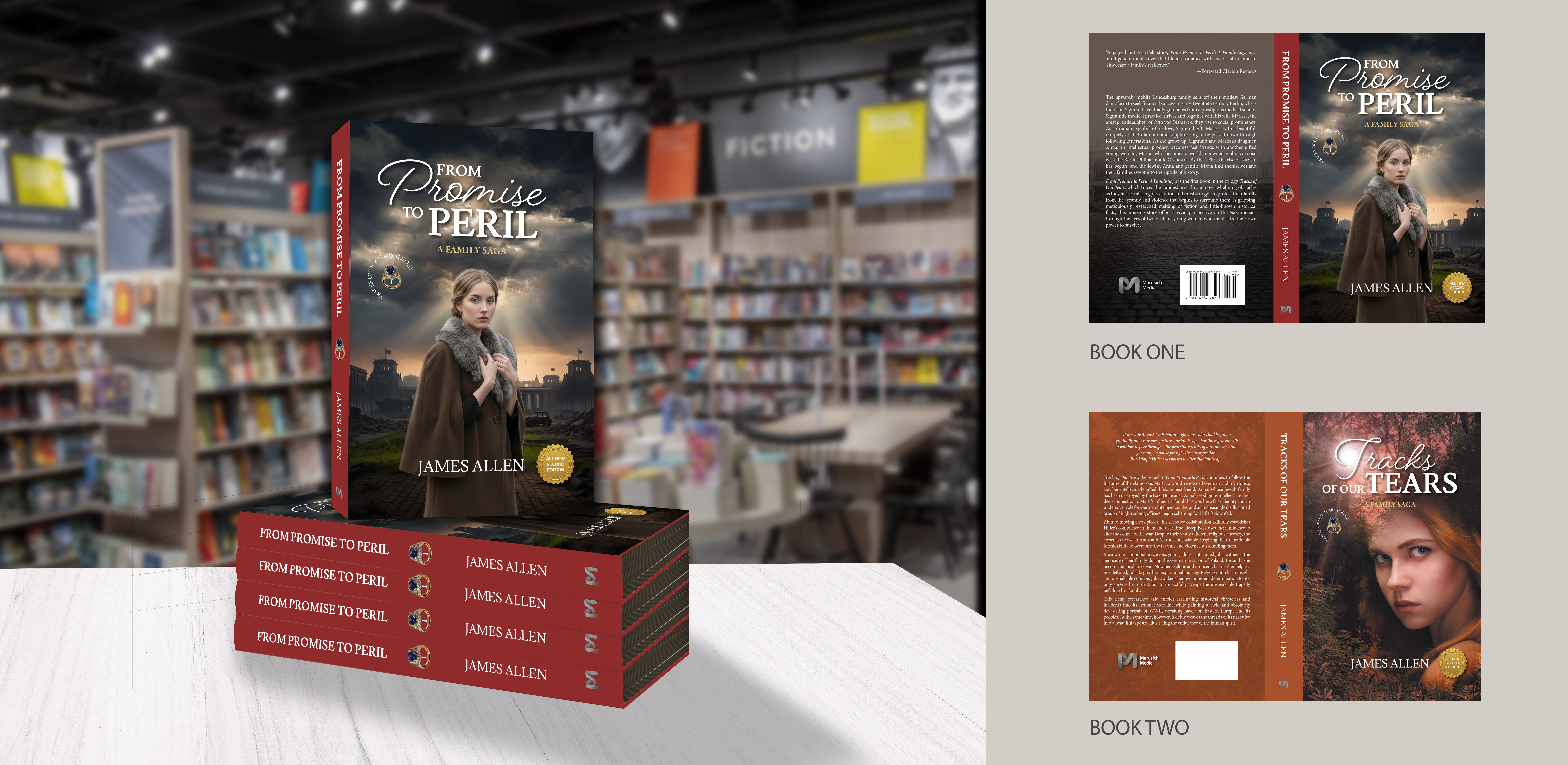
When author James Allen transitioned to a new publisher, the original covers for his WWII-era historical fiction series could not be reused, requiring cover redesign for a second edition.
The series explores resilience through strong female leads, tracing their interconnected stories across generations. The redesign balanced historical weight with a contemporary, marketable aesthetic, using a key visual element as a ring belonging to the author incorporated into the story and cover as a symbolic through-line across his books.
The first edition of Tracks of Our Tears is the only version currently in circulation. Its second edition will be streamlined, with its final section moving into book three to bring all three books closer to an even length.
Process
Inventing Anna.
The redesign began with the original editions, then moved into character studies, historical atmosphere, and a new visual language built for both books as a connected series.
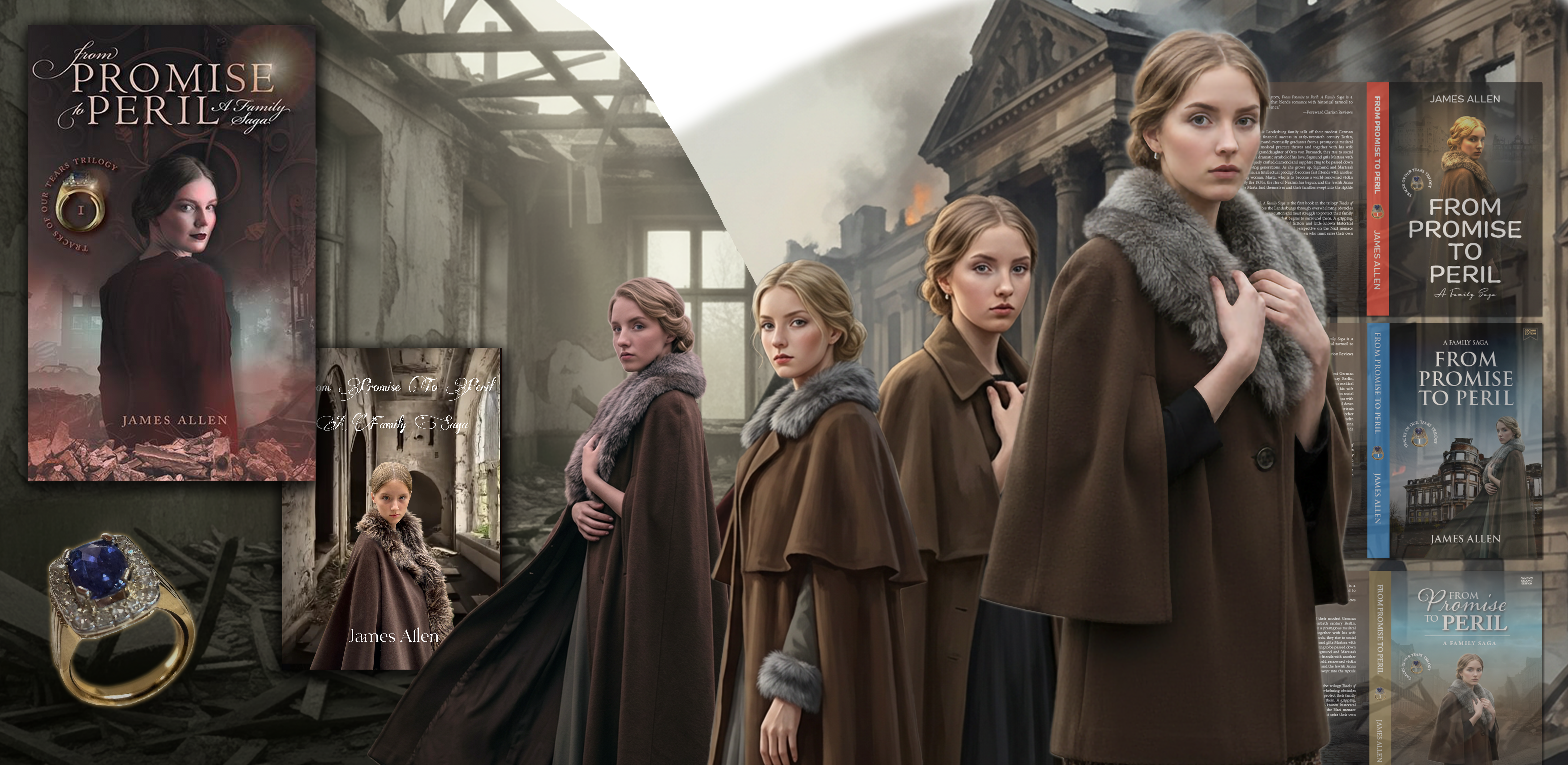
The character was based on the likeness of the author’s granddaughter and developed in Adobe Firefly, including the distinctive fur coat. A family-heirloom ring was woven into the story and visual system as a quiet thread connecting the series. The work moved through several iterations of cover concepts, character positions, typography, and backgrounds before the final direction emerged.
Starting point
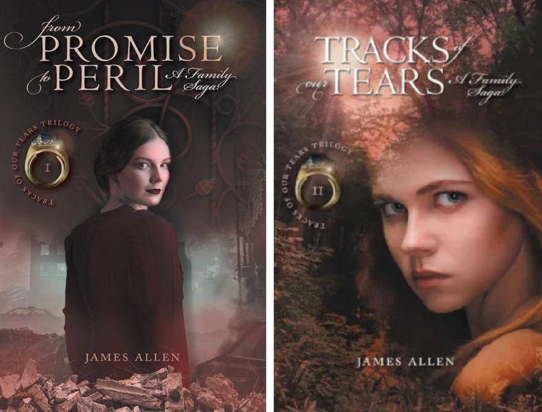
Two original covers.
The existing editions established the series and its characters; the new versions needed to honour that history while creating a distinct second-edition system. Tracks of Our Tears retained its image because the author still had rights to it.
Reflections
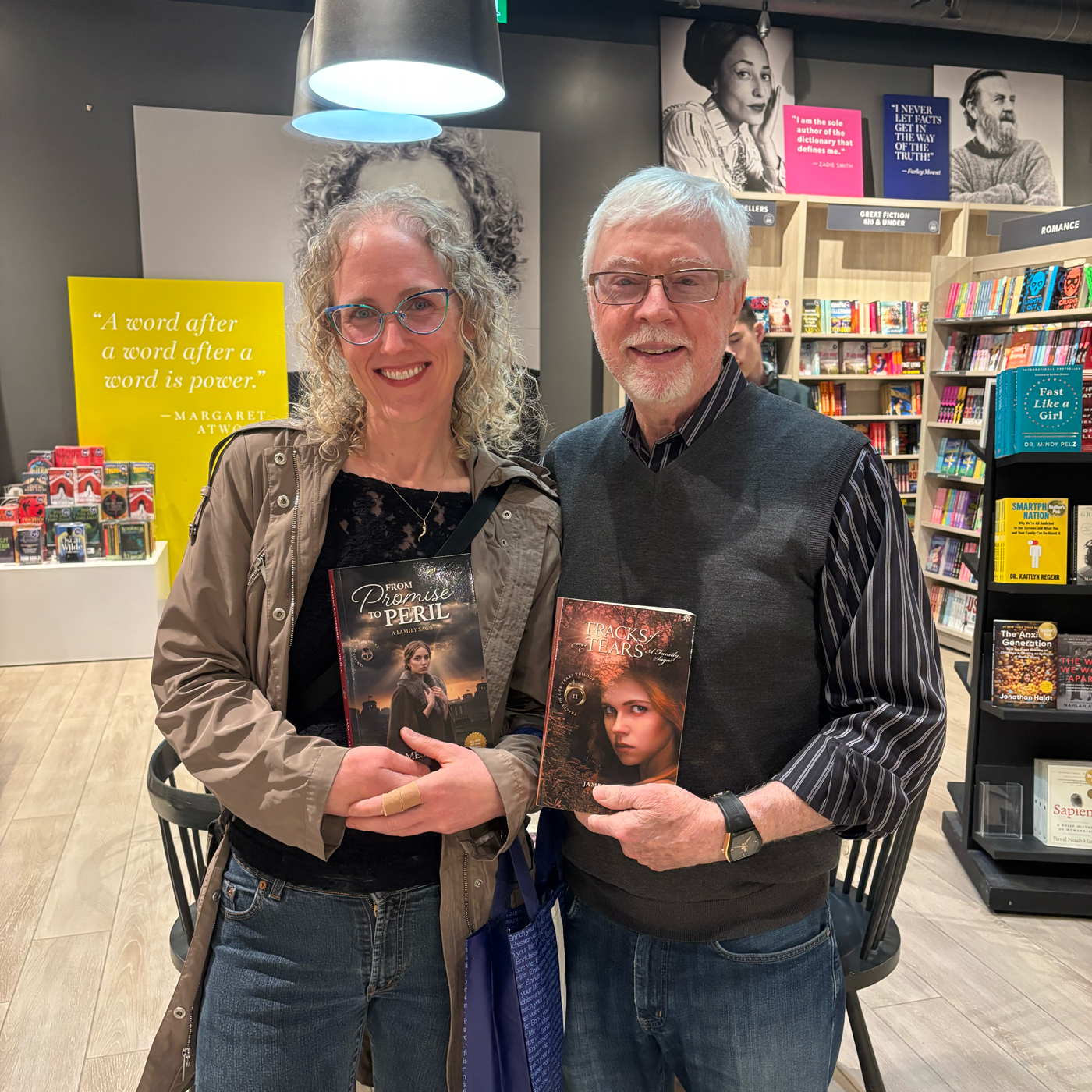
Making room for a new chapter.
This project reinforced the importance of adaptability when working within real-world constraints. Navigating differing image rights across the series required a flexible approach, reimagining one title while refining another to maintain a cohesive visual identity.